
Cogsy provides total inventory control for DTC brands. These brands would often make plans for the year to calculate how growth will affect their revenue. They will have a financial goal in mind and they’ll need to work out their MoM Growth based on this. Usually they’ll have a spreadsheet in which they’ll adjust the monthly numbers in order to reach their financial goal. This MoM Growth is also invaluable for Cogsy as it helps to provide a more custom and accurate forecast. What could a non-spreadsheet version work and look like?
Goal: Get brands to play with and save their growth plans within Cogsy
The goal of the project was to allow brands to easily play with different growth scenarios and get them to save their plans which would improve Cogsy’s forecasting.
Research
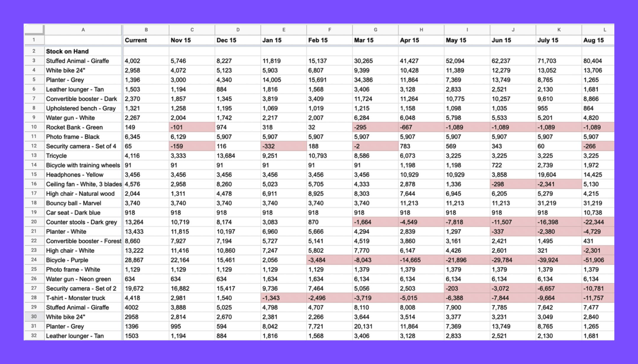
The first step was to speak with existing Cogsy’s customers to learn how they were currently doing planning. Below is an example of what one of their spreadsheets would look like.
Research showed us that spreadsheets were overwhelming and hard to keep up to date, but still the source of truth for most of the them. We also learnt that brands that didn’t have a dedicated operator where not always savvy enough to manually play with different growth scenarios.
Challenges
The challenges were twofold:
Trust – Brands have full control over the numbers on a spreadsheet, to let go off that control they need to trust the algorithm.
UX Challenge – Balancing the provision of control and reassurance with also providing a clean and clear interface.
Ideal Customer Outcome
The user can play with numbers to model different growth scenarios in order to achieve their financial goals for a period of 12 months and saves the plan to influence their forecast.
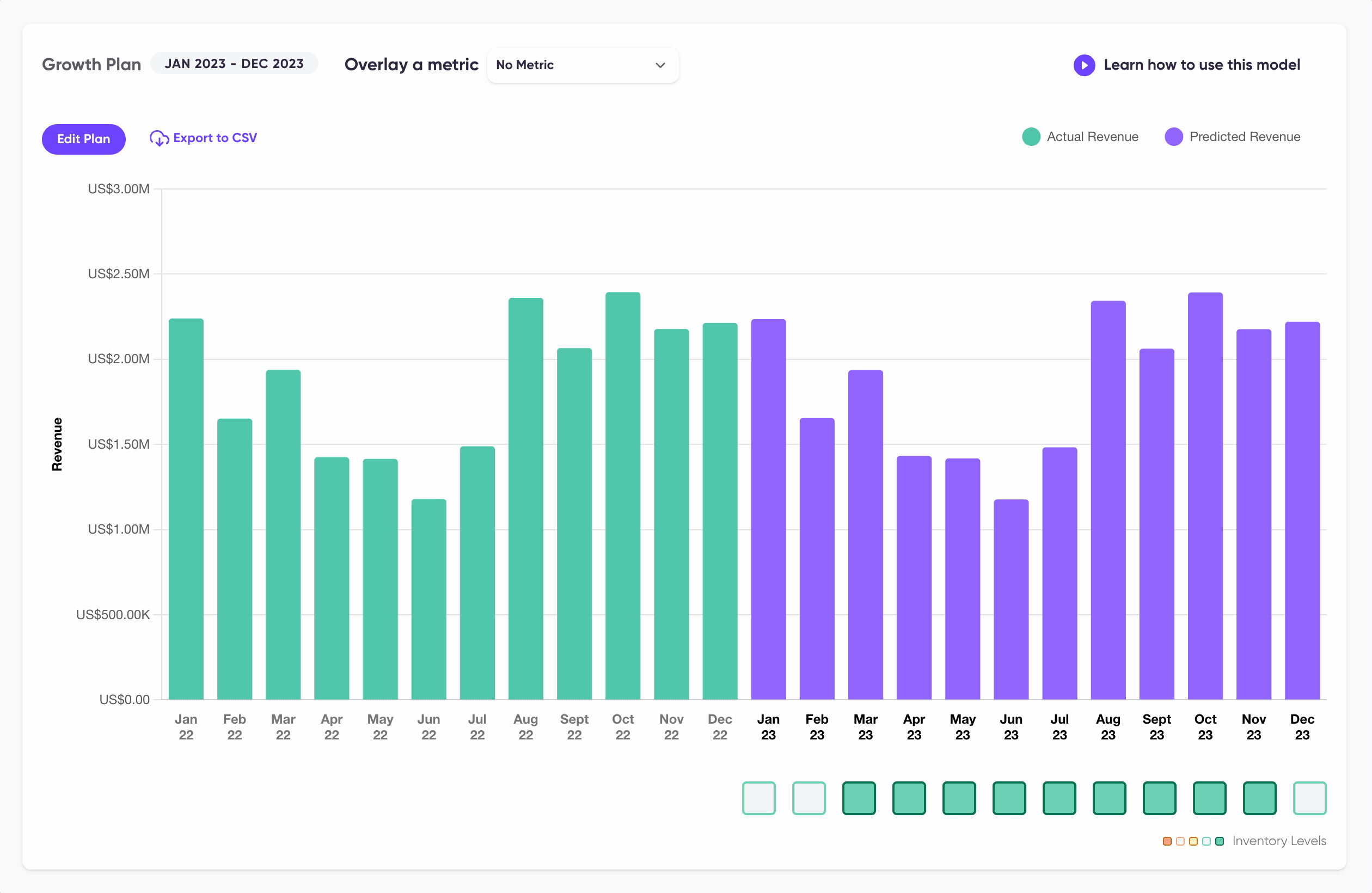
Version One: MVP out in the wild
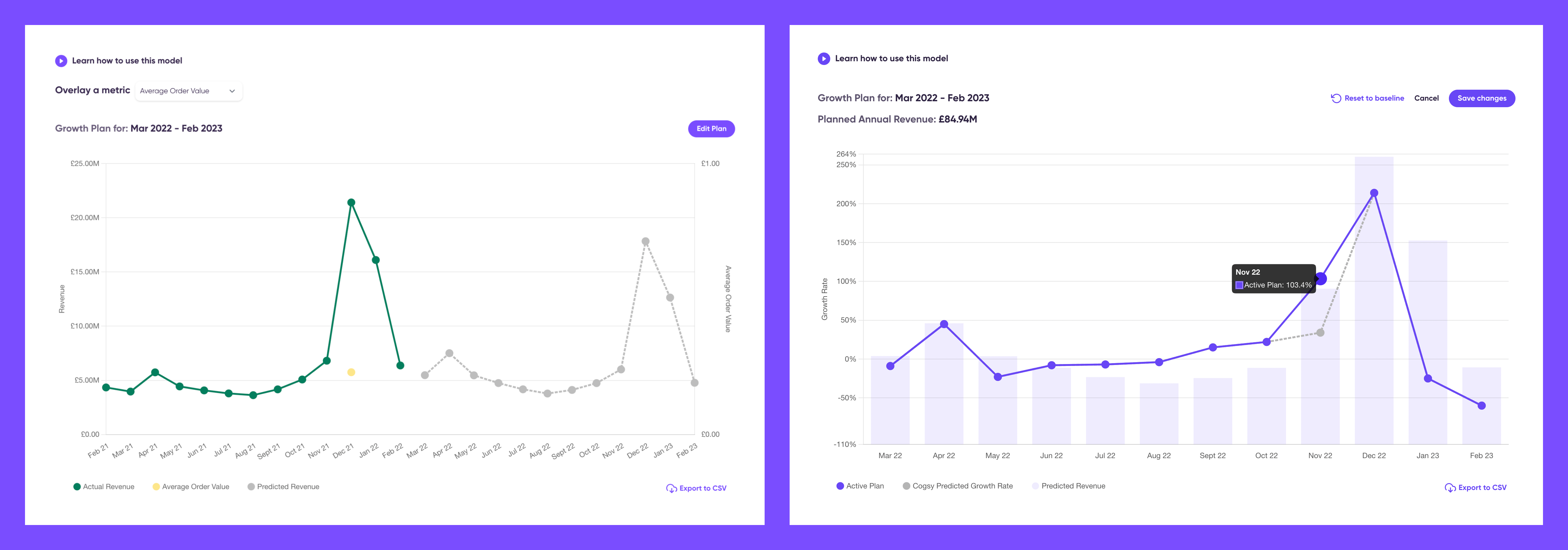
Version Two: Adding insights into stock levels
Right after delivering the Growth plan’s version one we wanted to allow some time to get feedback from users so in the following cycle we worked on adding an extra layer to also provide stock information for every month.
I researched potential options to visualise stock levels and since we wouldn’t be able to provide exact numbers we settled on a heatmap that would indicate how the change in growth or revenue would also affect stock levels.


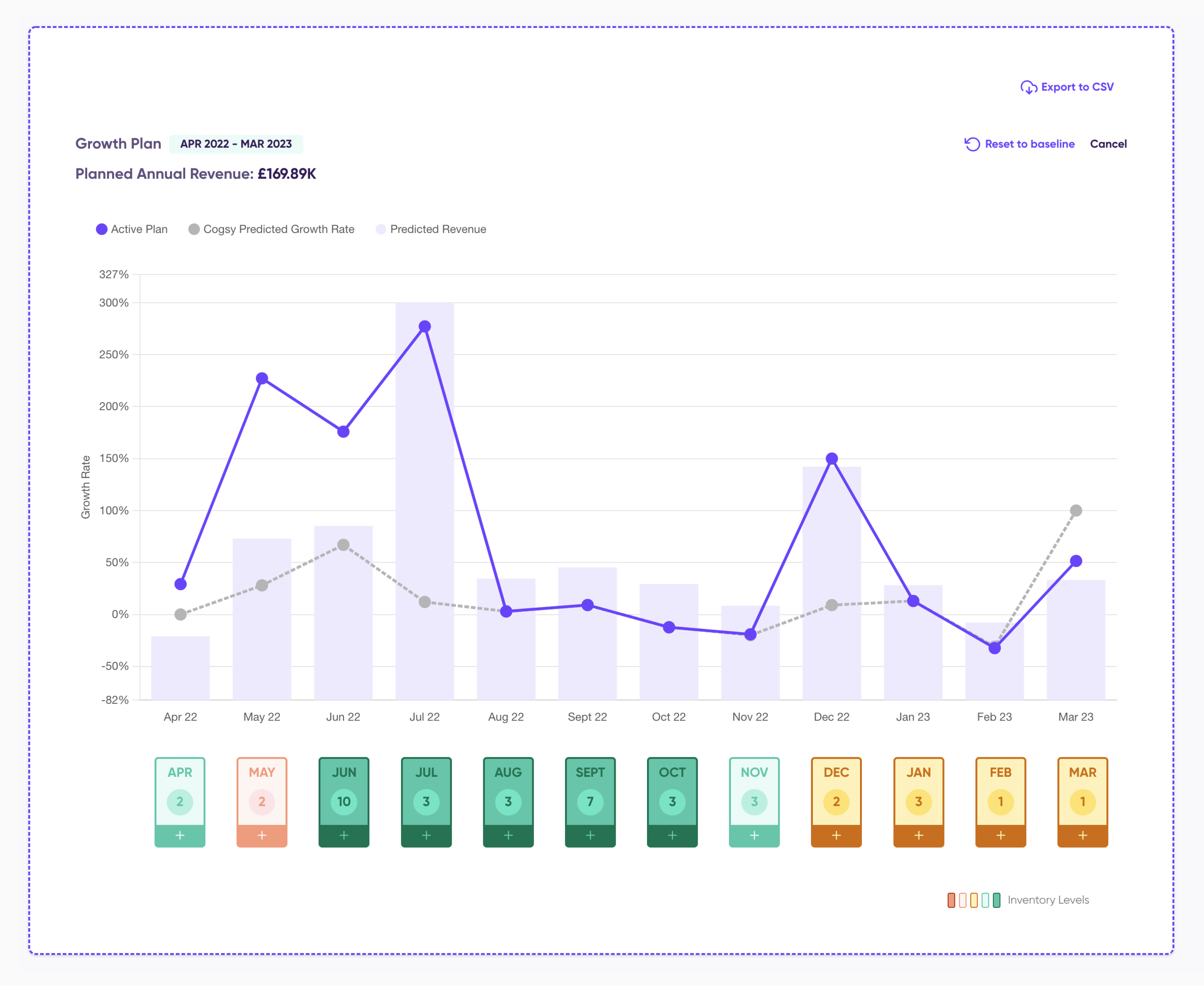
Feedback after launch: Feature uptake lower than expected
The feature uptake wasn’t as high as expected and after some user research that gather insights from support tickets, surveys and Hotjar we concluded that users want to play with different scenarios by using revenue as the controllable variable. Another issue was the difficulty selecting very specific values. Below is an exploration of potential solutions for a manual input.

It was decided to postpone this manual input update and instead provide revenue information from the tooltip as first step. I took the opportunity to work on a visual refresh. Making a clearer division between growth editing (line chart) and revenue (using always a bar chart). Alongside the UX and UI updates we kept iterating on the algorithm to increase trust on the tool.
Version Three:
